Making the case for mother of pearl
ERNA builds fine jewelry around mother of pearl — the shell that nurtures a pearl, and a material usually treated as a by-product. AIO named the brand and built it around that idea: identity, packaging, photography and a film shot at the jeweller’s bench.
The idea
The shell is not the leftover. It is where the pearl came from.
Mother of pearl carries a story of beauty formed slowly, then usually overlooked in favour of what grew inside it. That reframing — origin and transformation rather than off-cut — became the spine of the identity, and it is why the brand had to be shown being made rather than simply photographed.
Name, identity, package, image and film
Naming
The brand name itself. Everything downstream — the mark, the packaging, the way the film ends — hangs off the word you choose first.
Branding
Positioning, identity and the language around mother of pearl — a material with a story most jewelry brands never tell.
Packaging design
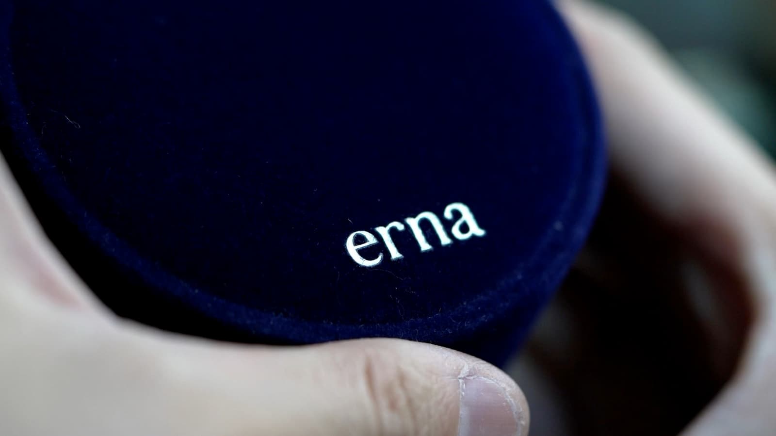
The box, pouch and mark a piece arrives in. For jewelry, packaging is the first thing a customer touches and the last thing they keep.
Photography
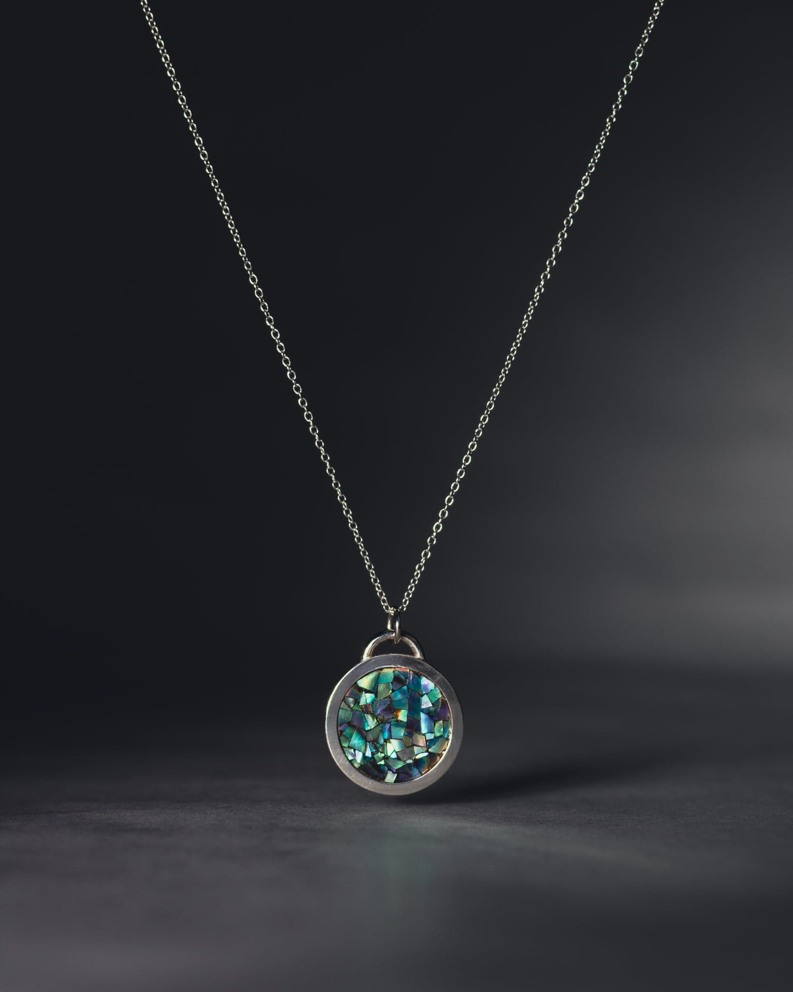
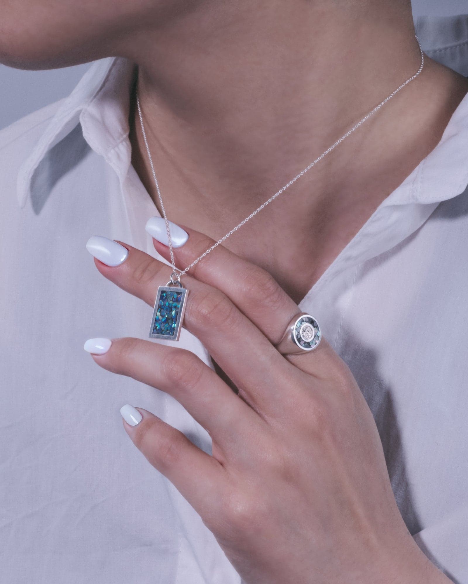
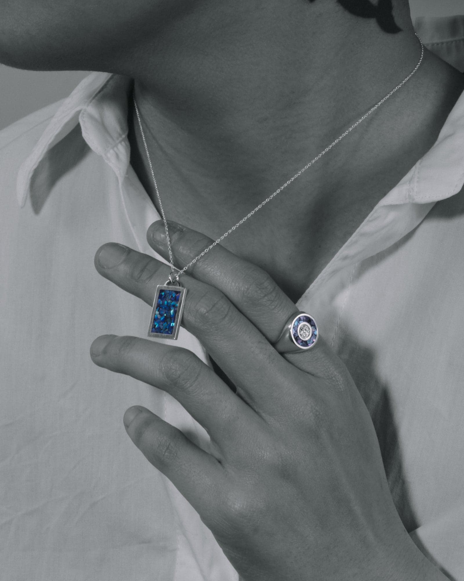
Product and detail photography across necklaces, earrings and rings — the images the store and the campaigns run on.
Brand film
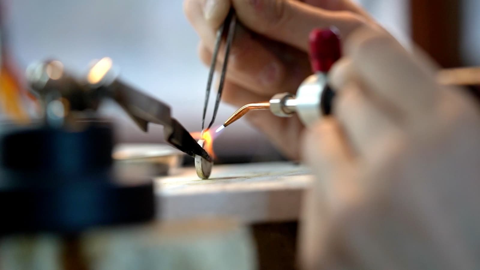
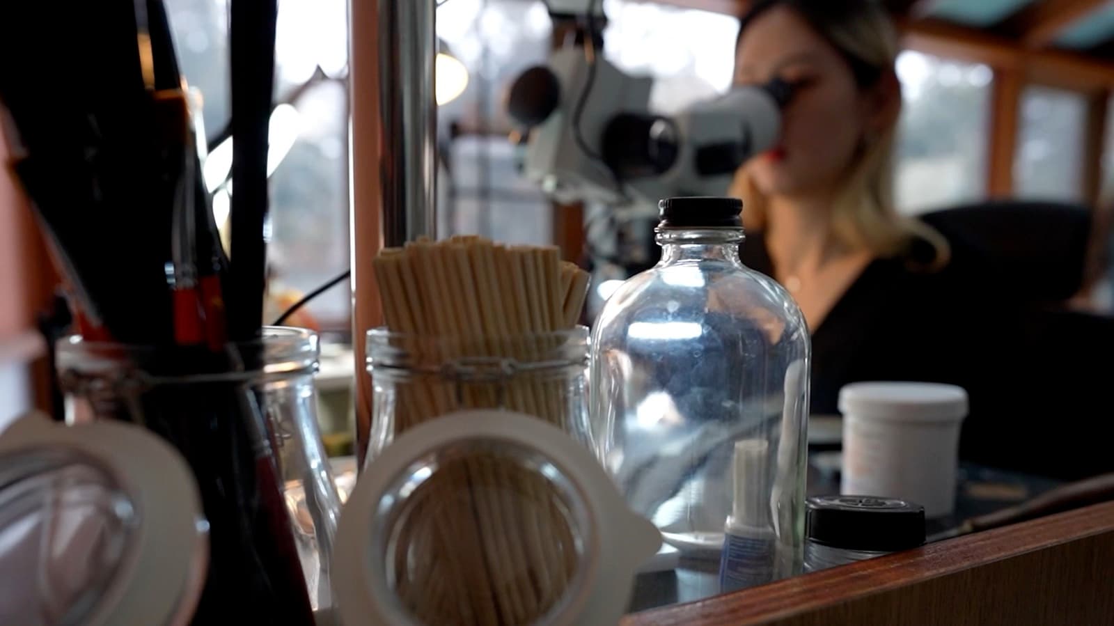
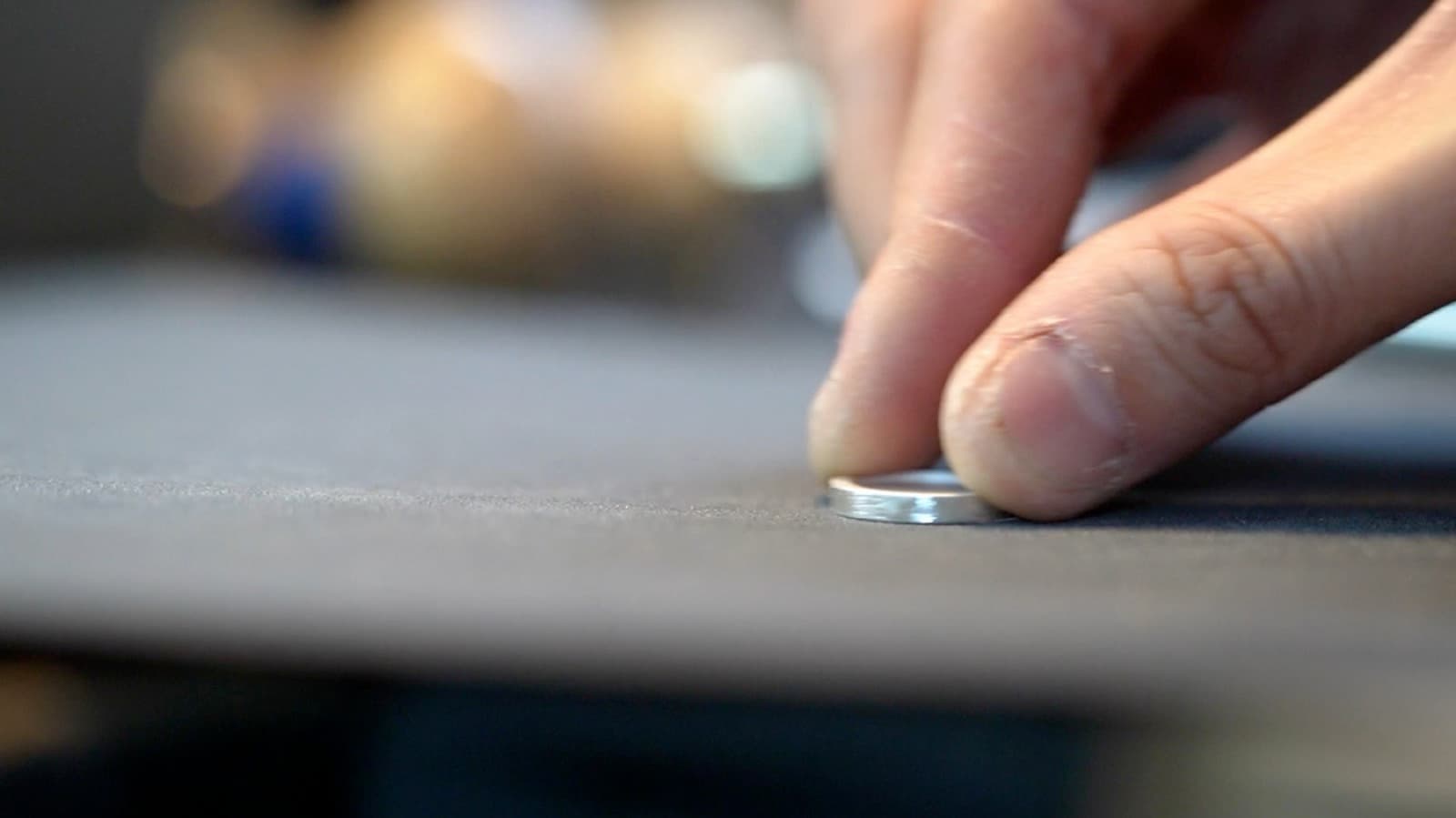
A film shot at the bench: sawing, soldering, polishing, setting, and the finished piece going into its case.
Three ways to photograph one material
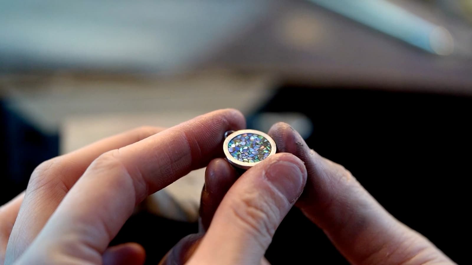
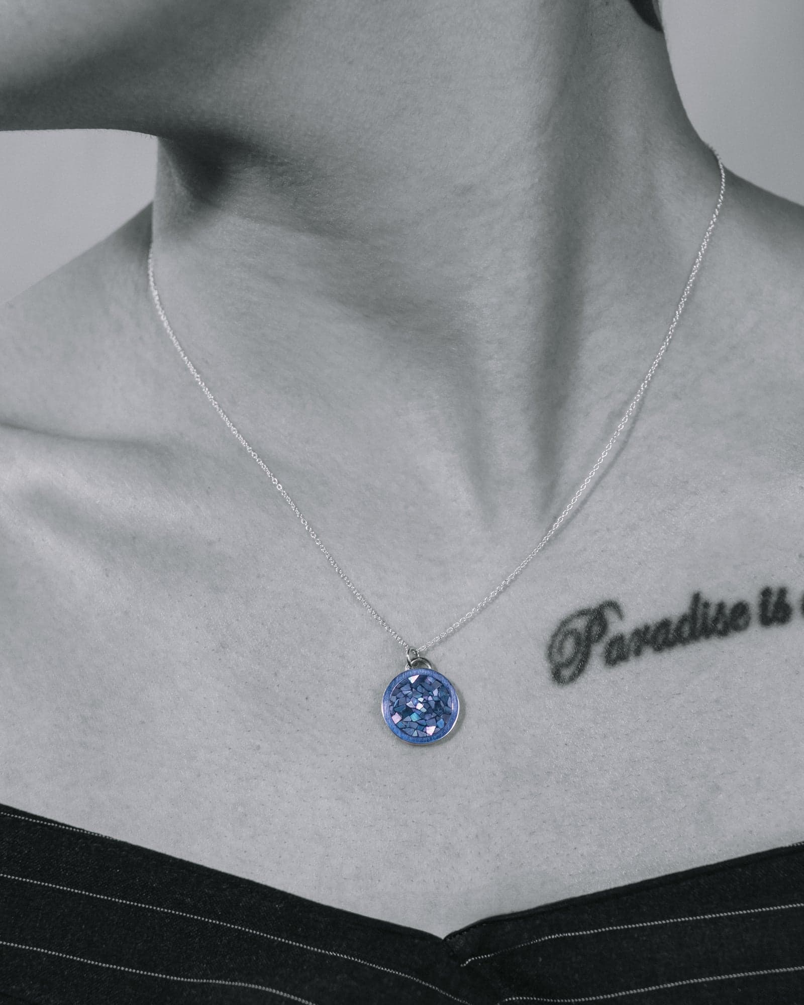
Mother of pearl changes with the light, so the shoot was built around it: a studio set that lets the inlay burn against black, a worn set that gives it scale, and a campaign set where colour is pulled out of everything except the shell.
Shot at the bench, not in a studio
The brand film runs a minute and a half with no presenter and no voice-over — only hands, tools and the piece taking shape. It ends where the customer starts: the finished jewelry closed into its case.
- 01Silver cut by hand on the bench pin
- 02Solder joins under an open flame
- 03Rotary polishing, one grade at a time
- 04The stone set and checked in daylight
- 05The finished piece closed into its case